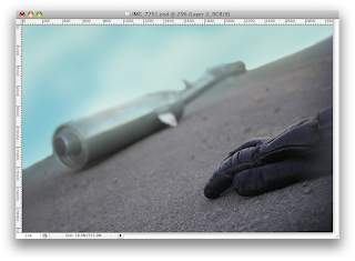
With the photo i took i didn't think the location really effective and felt the background houses had to be removed.
After removing the background i thought some sky would work well as a background image,
Next the visor had to be put on, not entirely sure the darkening quite works and feel the shape could be lightened to make it appear more like glass.
I lightened the visor bit and added scuff marks to the gloves and exhaust. But thought the visor could be cracked to help add to image of the crash.
The cracks i think work quite nicely, but the sky i don't think its quite working by itself.
I felt i could add a background to be image, i blurred it and put it under the blue sky layer but i thought it was still looking too blue.
I think this works quite nicely in getting the idea of a crash. But i think it still looks a bit flat and feel the lighting and colours could be adjusted to help make it more dramatic.


No comments:
Post a Comment