I liked the hanging tomatoes idea the most so i began photographing some to see if it was an idea that could work.
I thought it might work better than the previous design but it doesn't seem to work that well and feel that its looking a bit boring and bland.
So i removed the image and began looking at how else the image could be applied as i felt that i' d managed to get the type working and felt it just needed a image to compliment it.
I thought i could use the white space and have just a single tomato there but again i felt it looked a little boring.
I looked at adding a bit of colour to the design but again i didn't think it was a very interesting design.
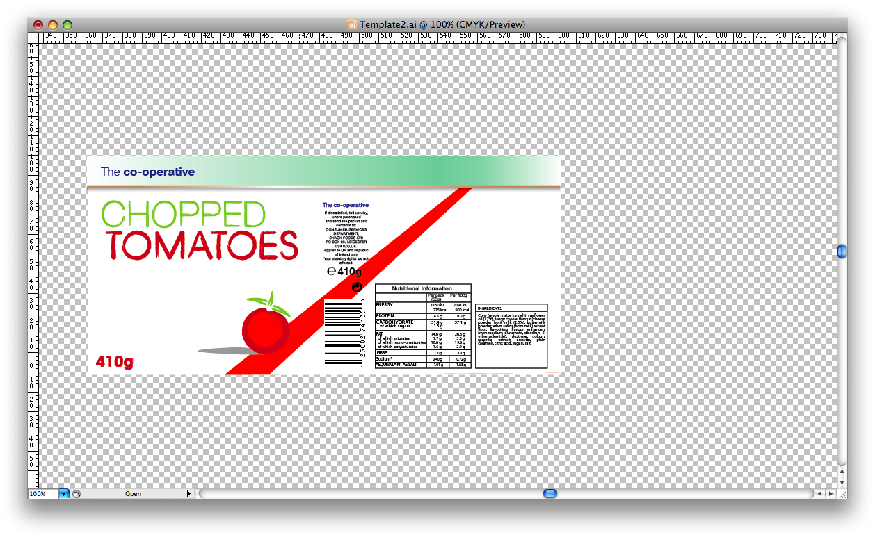
I looked at adding a sky like background to the design, i did feel that might be the photograph that didn't seem to be working and tried looked at adding the illustrated tomato into the design.
I looked at adding the card background to the design, but i feel like the other design its making look too cheap. I tried adjusting the type with the similar style to the illustration. I also fill in the illustration as it looked a bit hollow, so it wouldn't be lost in the background.
These two are some of a couple of attempts at adding some sort of background to the design as i didn't like the plain white background. I liked the bottom one as it kind of related to the other idea i had with the tomatoes being in grass.
I kind of like the child like quality it has and i started making some other veg in the same style as the tomato.


No comments:
Post a Comment